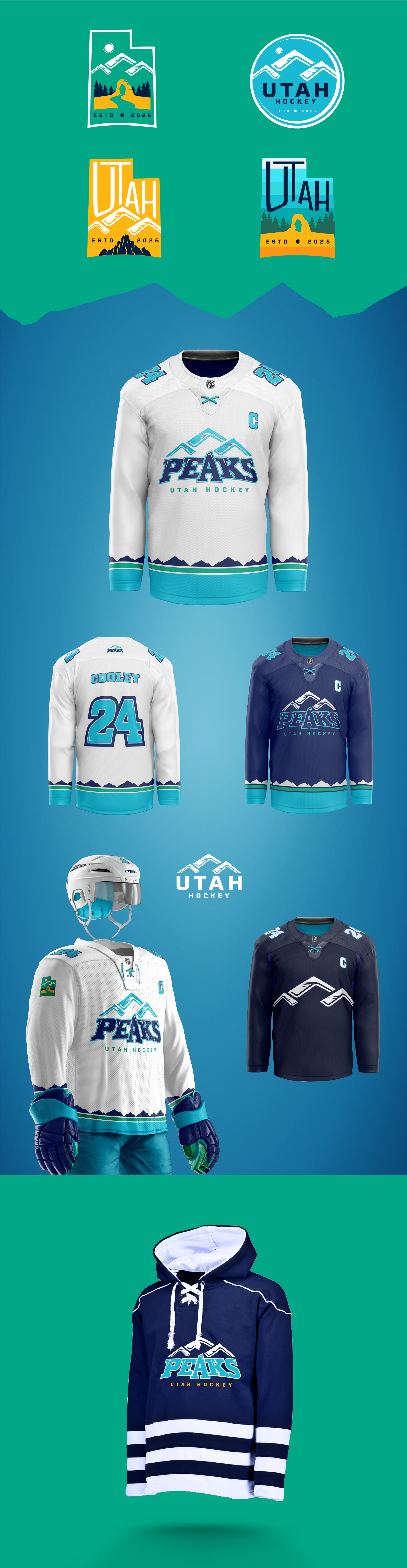
Rebranding Process for the Utah Hockey Club
My rebranding process for a team like the Utah Hockey Club begins with thorough research on the state and the sport. Although I'm not a hockey enthusiast myself (go Flyers!), understanding the local culture, history, and the essence of hockey is crucial.
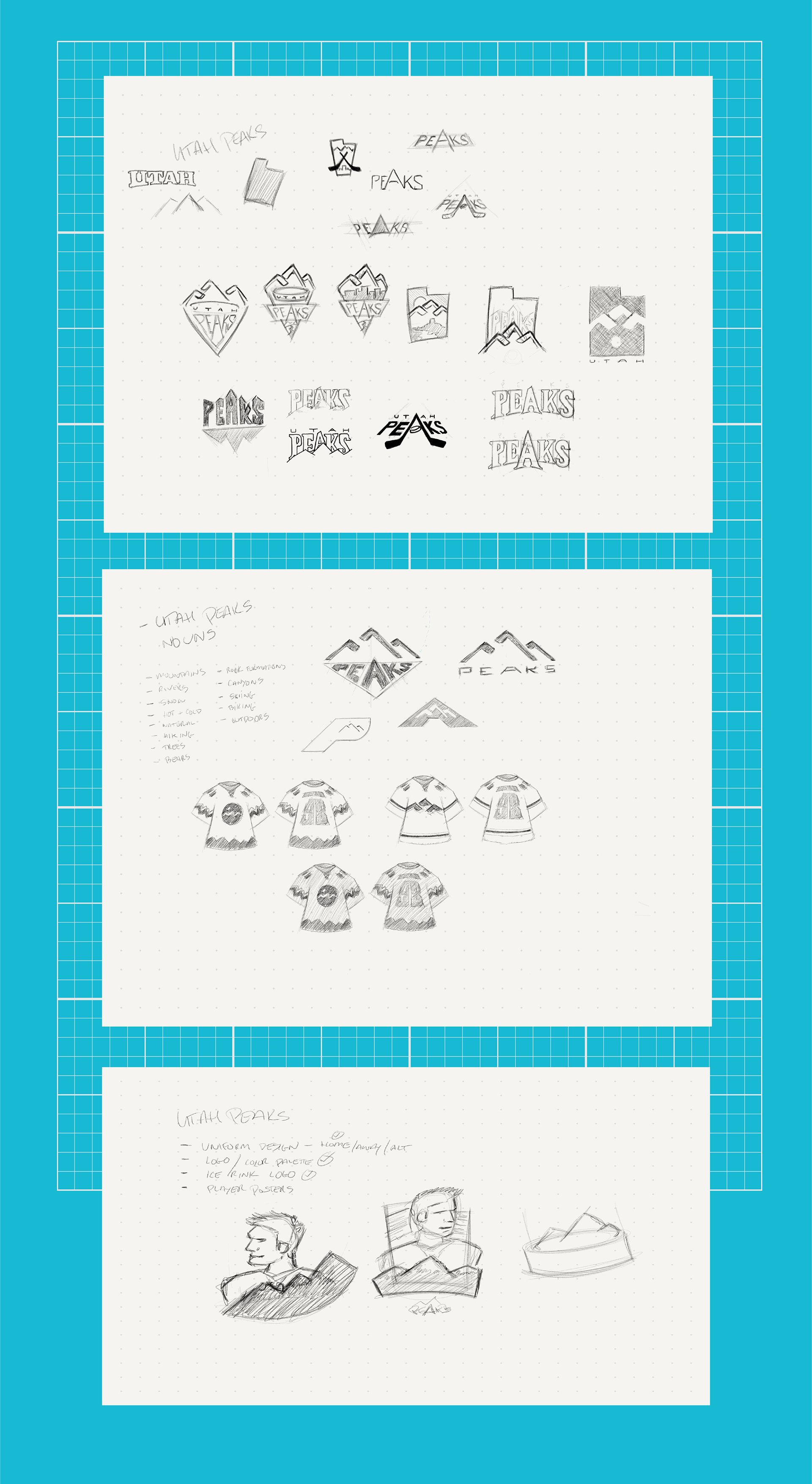
Next, I move into the sketching phase, where I play with forms and shapes, exploring various concepts until I find one that resonates. This initial stage involves a lot of creativity and experimentation. Once a promising concept emerges, I continue sketching to refine the logo, honing in on the details and perfecting the design.
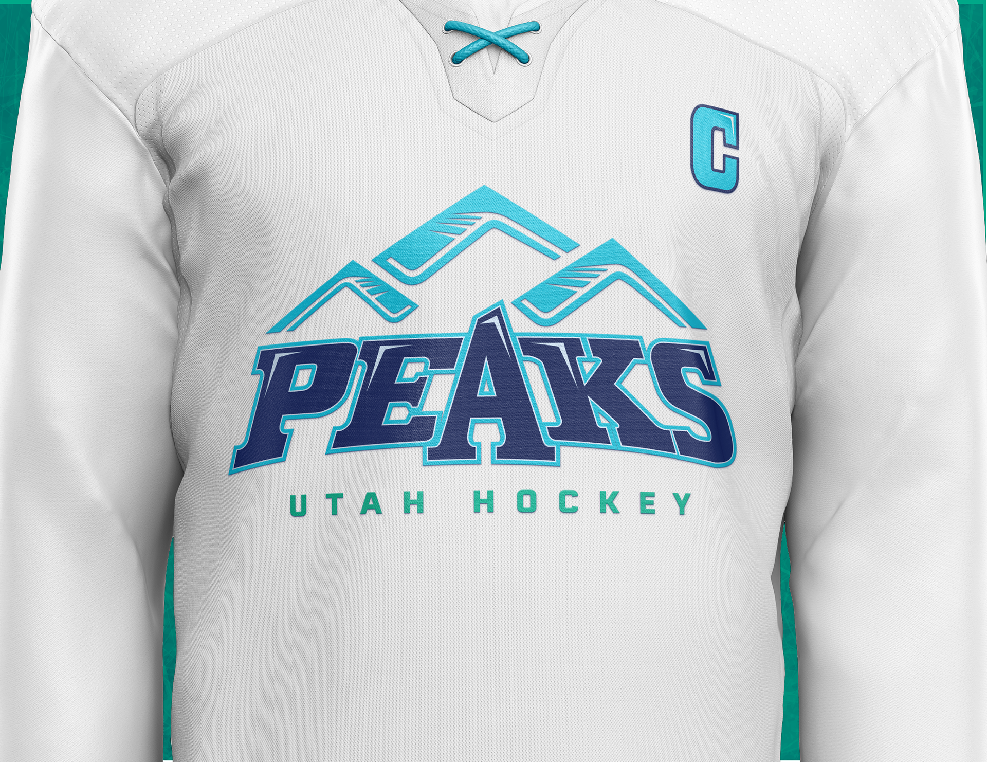
The final step is transitioning to the computer, where I further explore and pressure-test the sketches. This phase involves digital refinement, ensuring the logo is versatile, scalable, and impactful. Through this meticulous process, I aim to create a brand identity that embodies the spirit of the team and its connection to Utah.
The color palette will draw from the stunning hues of Utah’s mountains and weather, featuring Mountain Blue, Snow White, Granite Gray, Forest Green, and accents of Sunset Orange and Ice Blue. This visual identity will be bold, dynamic, and reflective of the state’s unique character.

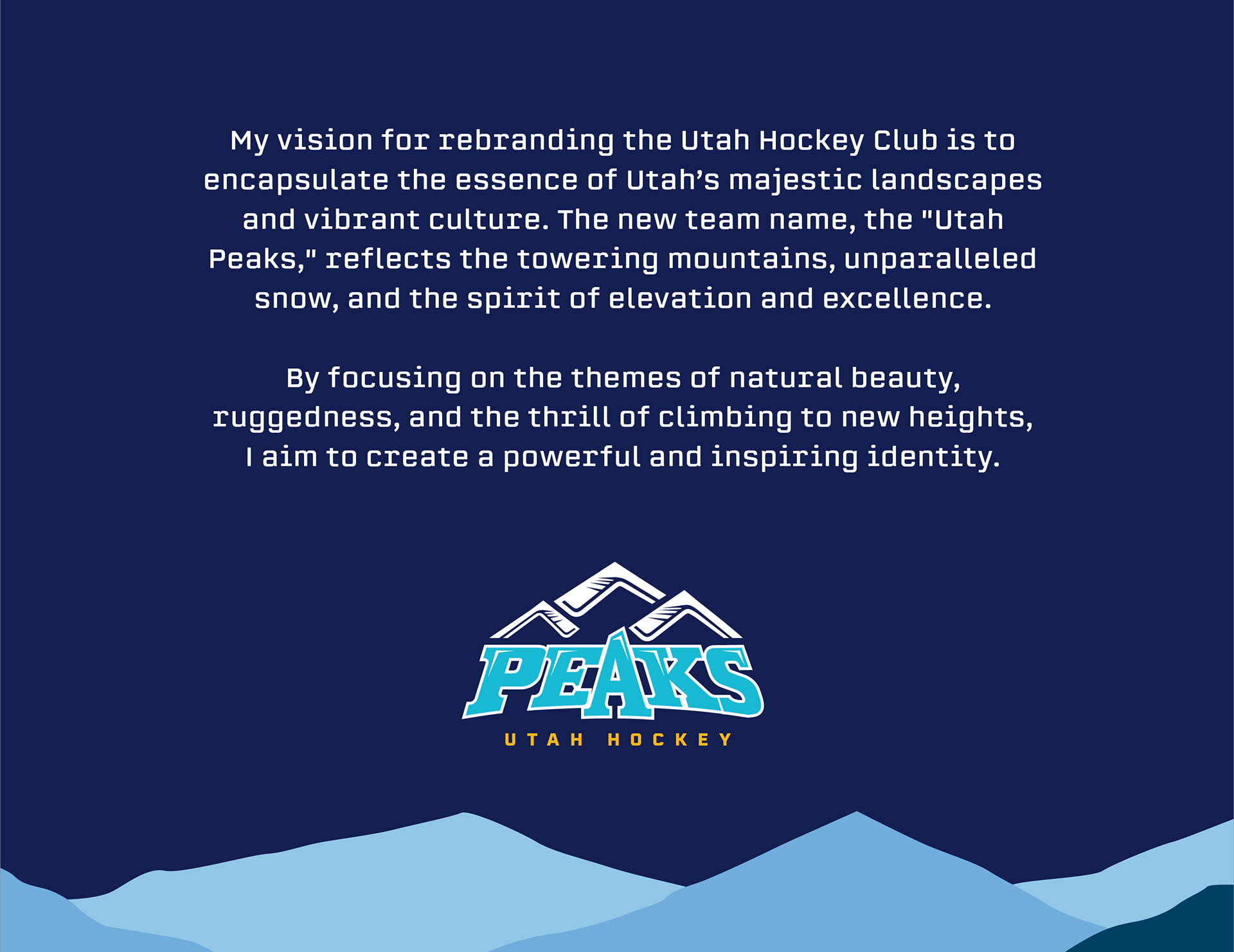
Through the rebranding, I seek to instill a sense of pride, excitement, and unity among our fans. The Utah Peaks will not only symbolize the highest altitudes but also the aspiration to reach the pinnacle of hockey excellence. Join me in this exhilarating climb as we embark on a new journey with the Utah Peaks.